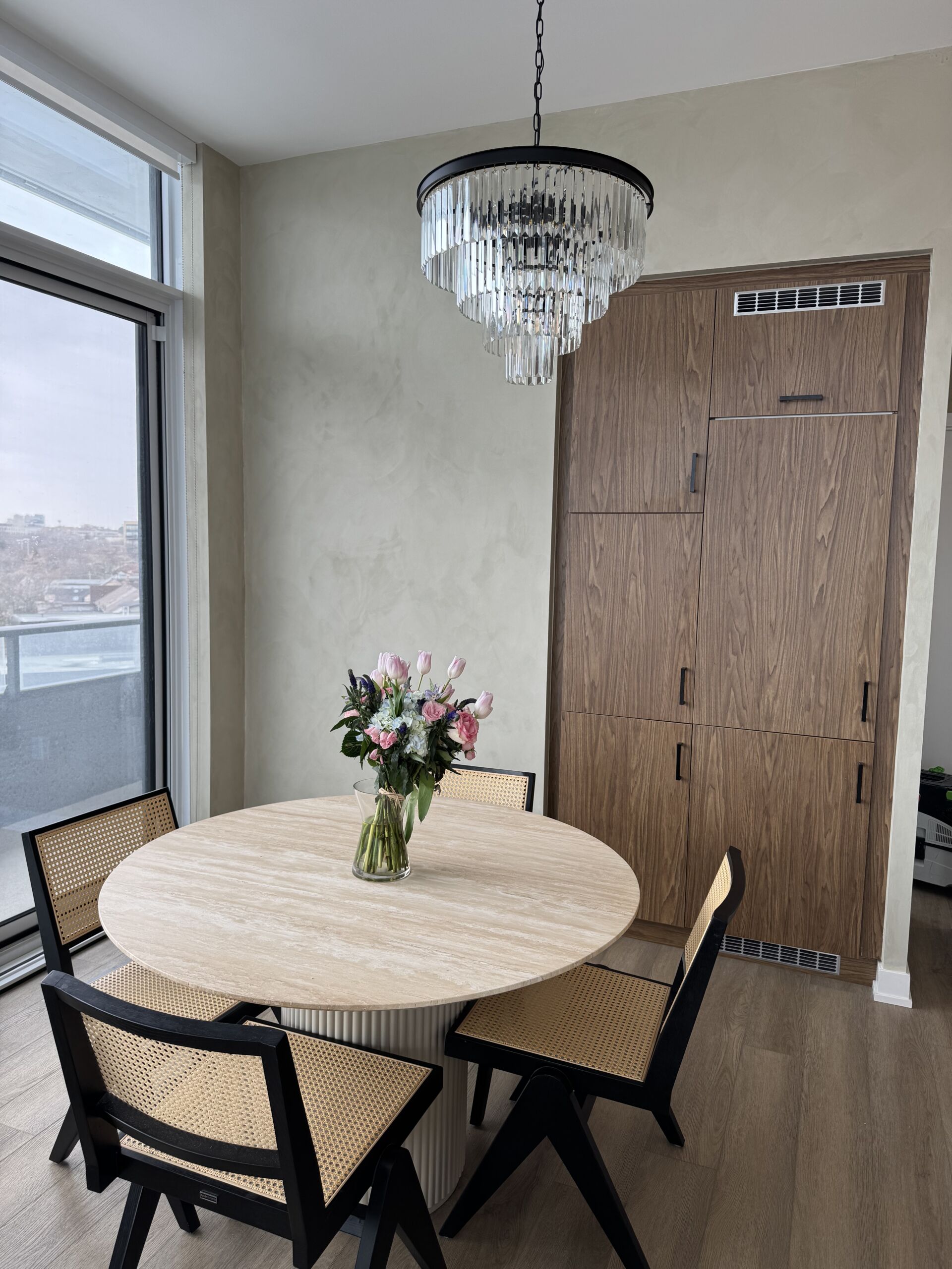
Colour Drenching: Striking Paint Trend 2025
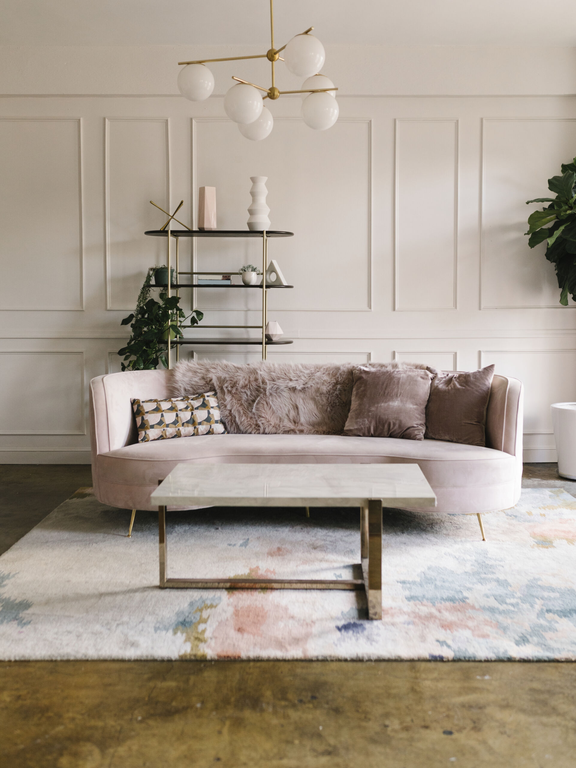
In 2025, colour drenching has officially cemented itself as one of the most captivating and sophisticated interior design movements—celebrated for its ability to completely envelop a room in mood and tone. Far beyond a fleeting trend, it’s become a defining design language in Toronto’s most design-forward neighbourhoods. Whether you’re breathing new life into a stately Georgian home in Rosedale, enhancing the architectural depth of a historic property in Forest Hill, or creating a bold visual statement in a sleek modern condo in Yorkville, colour drenching delivers a dramatic, tailored aesthetic that instantly elevates any space.
By saturating the walls, ceilings, trim, and even furniture in a single, rich hue—or tonal variations thereof—it creates an immersive environment that feels deliberate, artful, and deeply personal. In homes where character and atmosphere matter as much as craftsmanship, this technique resonates with discerning homeowners who see their living spaces as an extension of their lifestyle and identity.
What Is Colour Drenching?
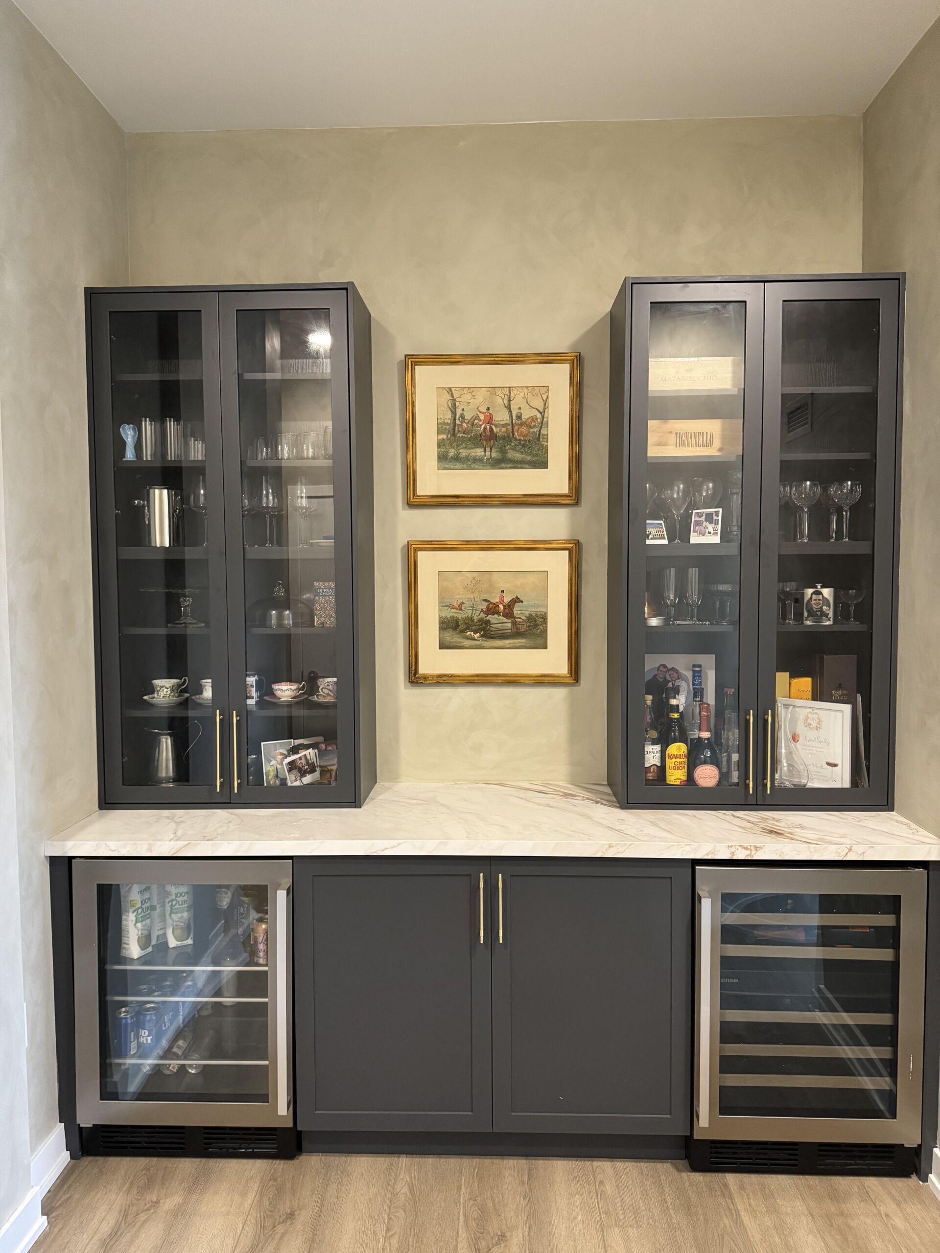
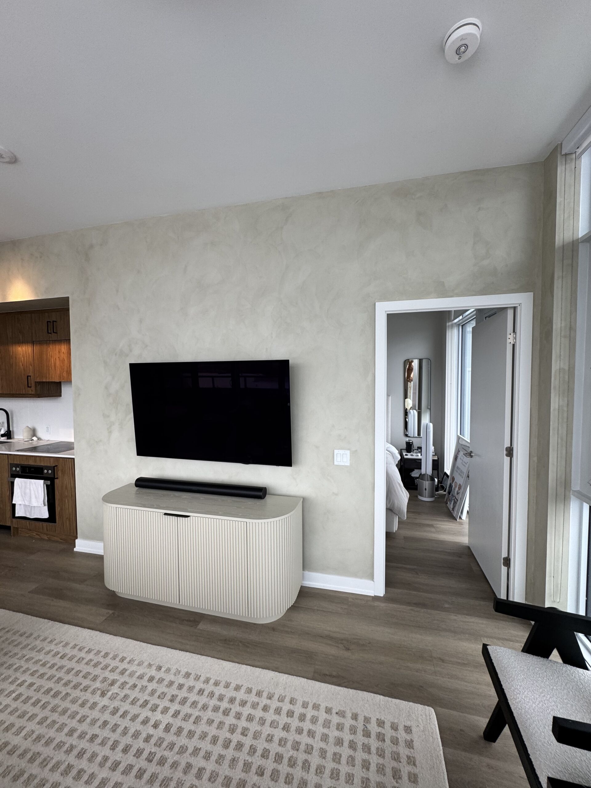
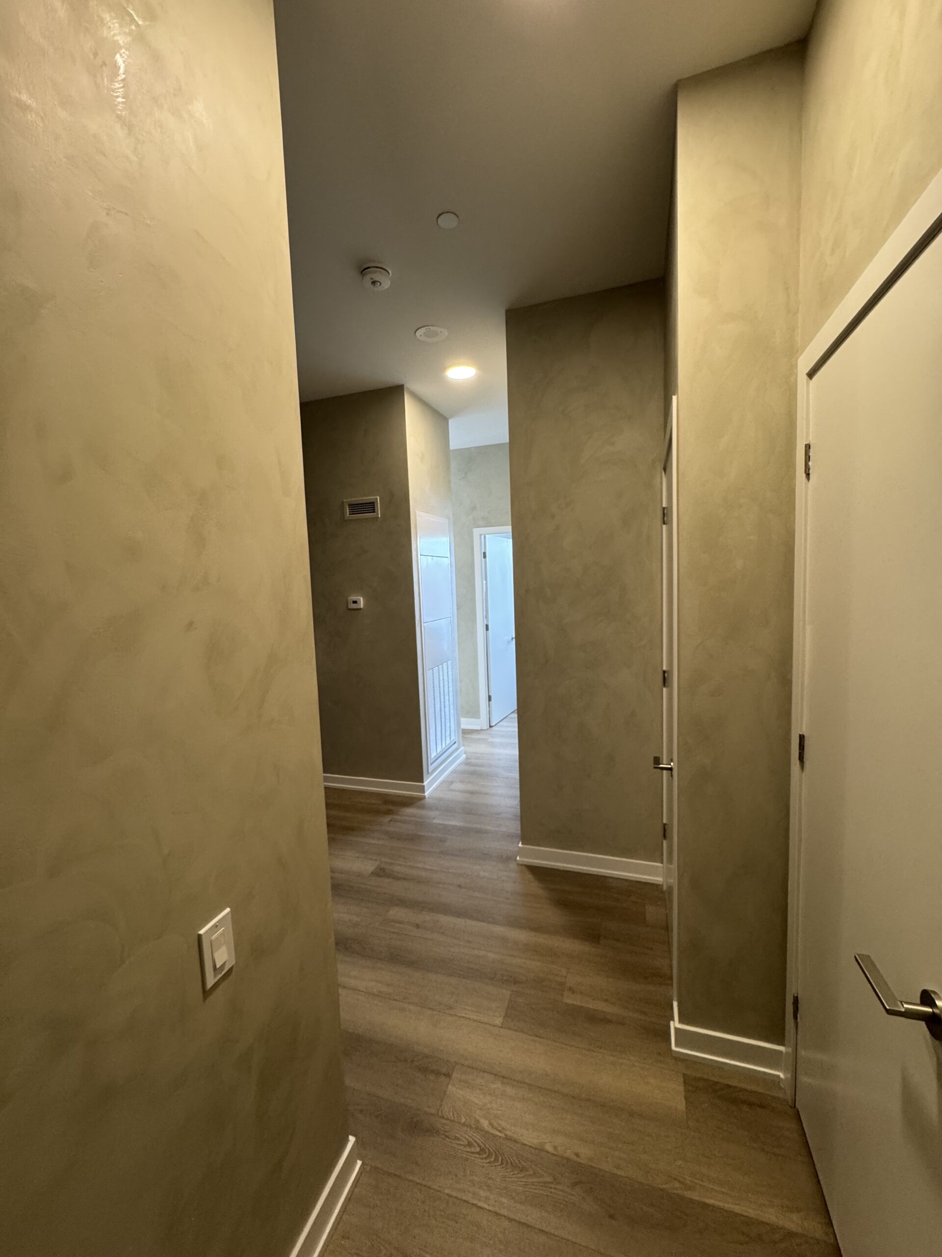
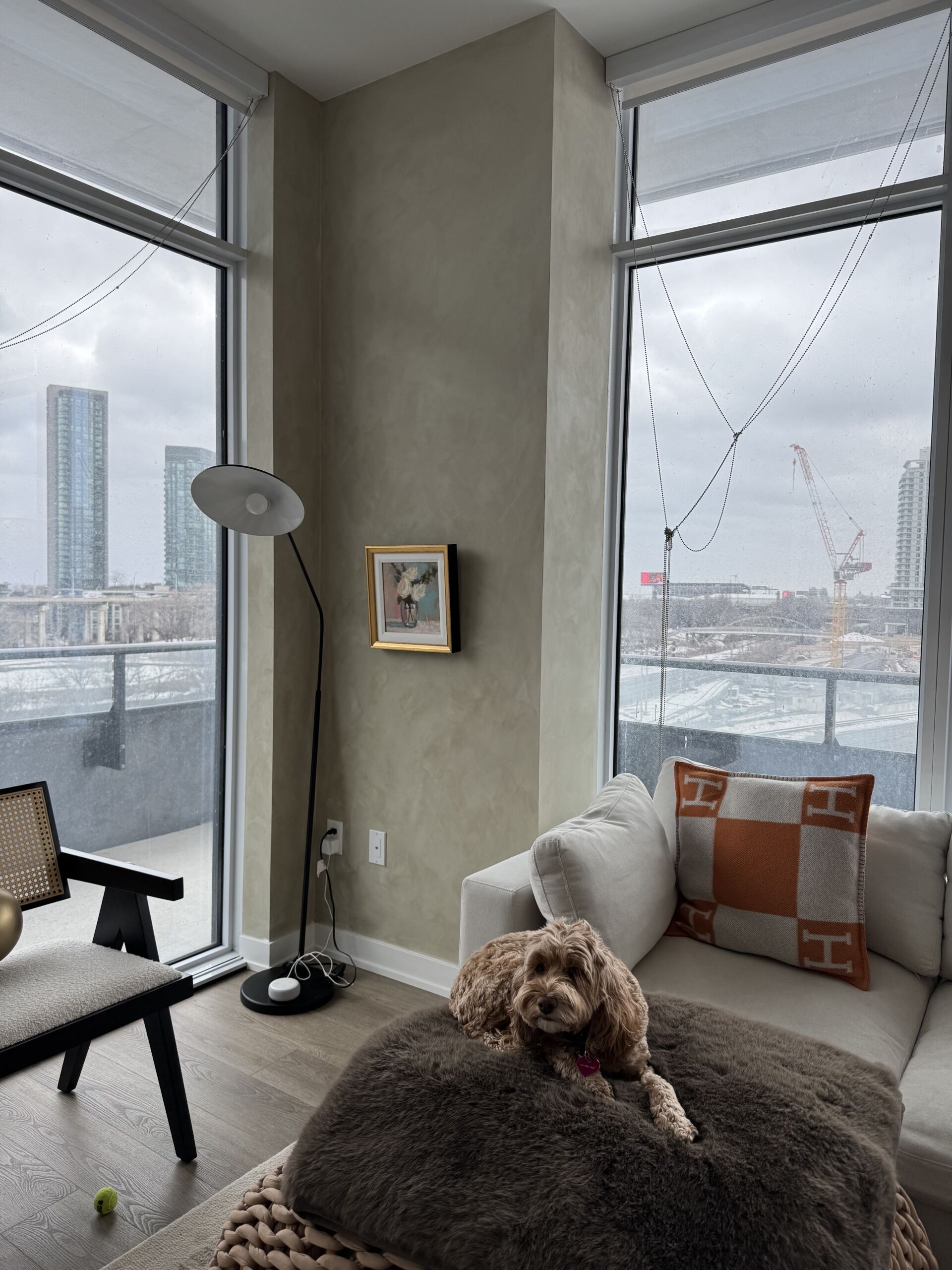
Colour drenching involves painting everything—walls, ceilings, trim, doors, and even built-ins—in a single hue or in tonal variations of the same colour. The result is a moody, immersive atmosphere that feels curated, intentional, and richly layered.
Why It’s In: The 2025 Perspective
As homeowners move away from stark, minimalist whites and greys, colour drenching creates immersive, expressive spaces that feel curated, warm, and cohesive.
Designers love it for the emotional resonance it brings—whether you’re going for a dramatic look or a tranquil retreat.
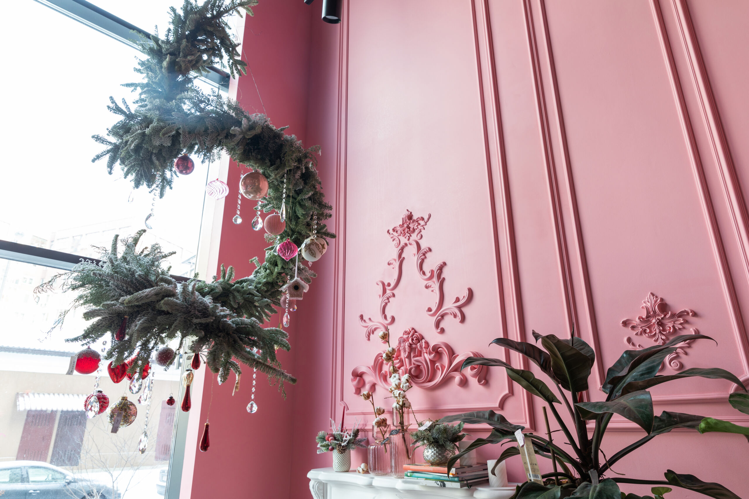
Paired with architectural details like tall ceilings and classic wall paneling, colour drenching emphasizes a room’s proportions and craftsmanship. In design forward homes across Toronto, from Summerhill to Moore Park, we’re seeing deep, saturated shades that highlight intricate moldings and add gravitas to historic interiors.
Speak To Shayan 416 (606) 8060 or Request A Quote
The 2025 Colour Palettes
Benjamin Moore’s 2025 Colour Trends embrace earthy neutrals, warm pinks, spicy browns, and heritage greens. These tones work beautifully when layered across an entire room.
Farrow & Ball continues to lead the way in character-rich shades like Sulking Room Pink, Railings, and De Nimes—all ideal for deepening the atmosphere of a space.
Benjamin Moore & Farrow & Ball: Colour Palettes We Love
Benjamin Moore continues to deliver rich, liveable shades like:
- Mysterious AF-565: A deep navy that brings instant drama
- Pale Oak OC-20: Soft and warm for a cocooning, neutral take
- Hunter Green 2041-10: Perfect for panelled studies and moody dining rooms
Farrow & Ball, known for its heritage hues and velvety finishes, offers shades that are perfect for this trend:
- Hague Blue: Deep and luxurious, ideal for libraries and tall-ceilinged entryways
- Dead Salmon: A warm, historic neutral that flatters wall paneling
- Studio Green: Gorgeous in natural light and stunning when applied to trim and ceilings alike
Setting the Mood with Colour
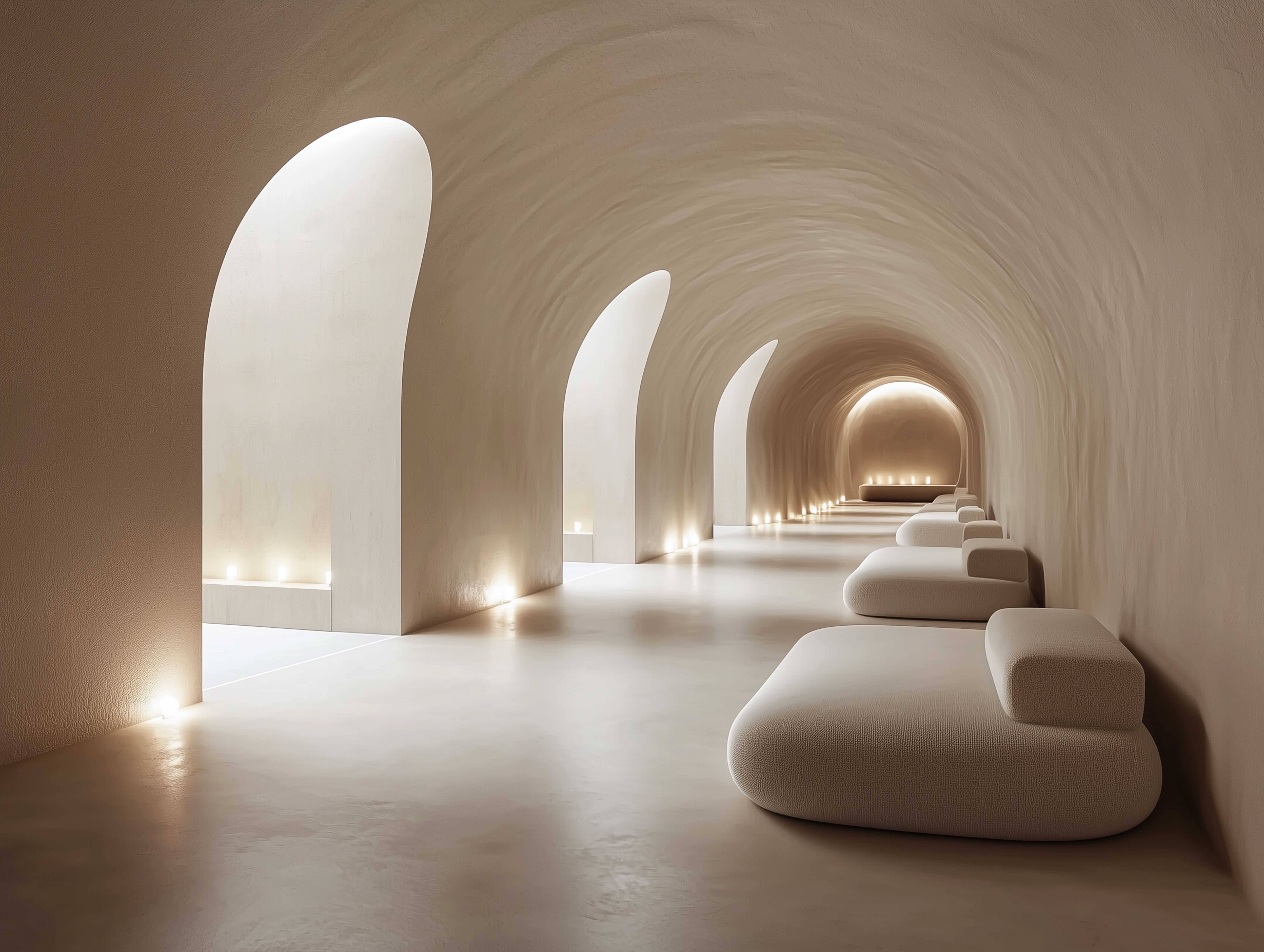
Colour drenching isn’t just about style—it’s about atmosphere. Deep greens and blues bring tranquility and depth, while earth tones like terracotta and clay create a grounded, comforting vibe. Lighter monochromes can expand a space visually and soften transitions between surfaces, especially in open-concept homes.
Luxury homes in neighbourhoods like Moore Park or Lawrence Park often feature soaring ceilings and intricate wall paneling—perfect canvases for colour drenching.
When tall ceilings are painted in the same hue as the walls and trim, it blurs the boundaries of the room, drawing the eye upward and creating a cohesive visual field. The effect? Rooms feel larger, more curated, and grounded in designer intention.
Panel moulding or wainscotting, common in Forest Hill's heritage homes, can be enhanced through tone-on-tone colour schemes, adding depth and subtle elegance to every angle.
The Mood: Sophisticated, Calming, Dramatic
Whether you want a cocooning, warm bedroom or a moody formal dining space, colour drenching offers emotional resonance. In high-end Toronto homes, it's become the go-to strategy for homeowners who value mood, storytelling, and design continuity.
Design Tip: Opt for matte or eggshell finishes to reduce glare and increase saturation. Keep colour families unified, and use finish contrast (e.g., matte on walls, satin on trim) to add dimension without breaking the palette.
Expert Touch with Chromatist Colour Consultant
Want to get it just right? Our in-house colour consultant helps clients choose the right shades and finishes to match your home’s light, furniture, and architectural style.
Colour drenching in Toronto homes: Everything You Need to Know About It...
Ready to Drench Your Walls in Style?
Transform your Toronto home with the elevated impact of colour drenching. Whether you're envisioning deep, moody tones or serene monochromes, our expert painters bring your vision to life with precision and artistry.
📞 Call us at (416) 606-8060
Request your personalized quote today and begin your journey toward a more immersive, luxurious space.


